
Men in Print
This is the third blog of the series of curated articles that were first published by Print Week as part of its Prints Past series, which ran for ten years from 2011. In this blog, we are going to take a look at some of the important men in the history of printing, from the man behind the first comprehensive description of all aspects of typefounding to one of the most influential figures in twentieth-century British graphics. Do you recognise any of the names? Who else do you think should be highlighted when we recount the history of printing? (You might notice that this blog does not mention any women in print; we will dedicate our next post to them!)
John Day
The name John Day (1522-84) might not strike many cords with today’s typographic fraternity, but in the sixteenth century he was England’s most famous Protestant printer, practicing his craft from the sign of the Black Horse in Aldersgate, where today hangs a plaque in his memory. Best known for printing John Foxe’s Actes and Monuments, Day originally printed controversial religious works, but later completed some of the largest and most technically difficult printing projects of his time. The technical excellence of his printing was matched by his business skill: through connections with powerful figures at Court, Day was able to secure several lucrative monopolies, which he held throughout his career. Day printed his first music book, the Arum Missal folio in 1557; it was a typographically fine publication, a copy of which can be seen in the British Museum. But Day was a wit as well as a printer: ‘Arise for it is Day’ was the punning headline he used to publicise business, a joke which extended to his house name: ‘Resurrection’.
Joseph Moxon

Joseph Moxon. Line engraving by F. H. van Hove, 1692, Wellcome Collection
In the seventeenth century London’s typefounding trade was very limited both technically and aesthetically, and few had an informed interest in typographical matters. It is surprising therefore that the first comprehensive description of all aspects of typefounding (punch-cutting, mould and matrice making, casting etc) ever to be written was published in London in 1683. Its author, Jospeh Moxon (1672–90), was a man of many parts: publisher and seller of scientific books; printer, typefounder and confidant to the elite of British science. His Mechanick Exercises applied to the Art of Printing (1683–6) was originally issued in 24 serial parts. This was the first ‘Printer’s Manual’ and besides the punch-cutting and type-founding sections contained detailed information on all other aspects of the letterpress printer’s trade.
That part of the book, which in today’s terms can be described as ‘Teach Yourself Typefounding’, is not easy reading and it would be interesting to know just how many people attempted and actually succeed to teach themselves to print and cast type with the help of Moxon’s Mechanick Exercises.
William Savage
The early nineteenth century was a golden age of book collection, the heyday of large paper copies, limited editions, and books with coloured illustrations. It was the ideal time for William Savage, one of the best printers in London, to bring to fruition his plans for a work on colour printing from wood engravings, and to revive the long-neglected art.
In the Gentleman’s Magazine (August 1815) subscriptions were solicited for a work to be called Practical Hints on Decorative Printing, at five guineas for small paper copies, and eleven for large. The edition was to be strictly limited to subscribers and all the blocks were to be destroyed as soon as the work was finished. Subscribers could view the job on press.
Today Savage’s work is of interest only to scholars and enthusiasts of printing and the graphic arts. He forms a link in the chain between the first attempts to illustrate the book in a medium that could be multiplied and made accessible to all, and designers, printers and publishers of today.
Edmund Evans

‘The Green Leaf and the Sere’ illustration, printed by Edmund Evans from an image by Mary Ellen Edwards, in The Girl's Own Annual, vol. ix, 1887-1888
Edmund Evans (1826-1905) was a wood-engraver and colour printer. Born in Southwark, two years before Thomas Bewick’s death, he lived to be the last of the great commercial wood-engravers, and the best known, through the children’s books, which made his name a household word. When he died in 1905, the days of the commercial wood-engraving firms were over; books, magazines and newspapers were illustrated with photographically prepared and chemically etched zinc process blocks.
Although commercial wood-engravers reproduced artist’s original drawings on wood, many of the leading engravers were themselves men of originality and the skill of a good wood-engraver was often much greater than that of the artists whose work they were responsible for reproducing.
Their profession was at the very heart of the Victorian book and magazine world and Kelly’s Post Office directory of stationers, printers etc. lists a total of 128 wood-engravers in London in 1872, which had increased to 175 by 1885. How many individual engravers were employed, nobody knows.
Henry Lewis Bullen
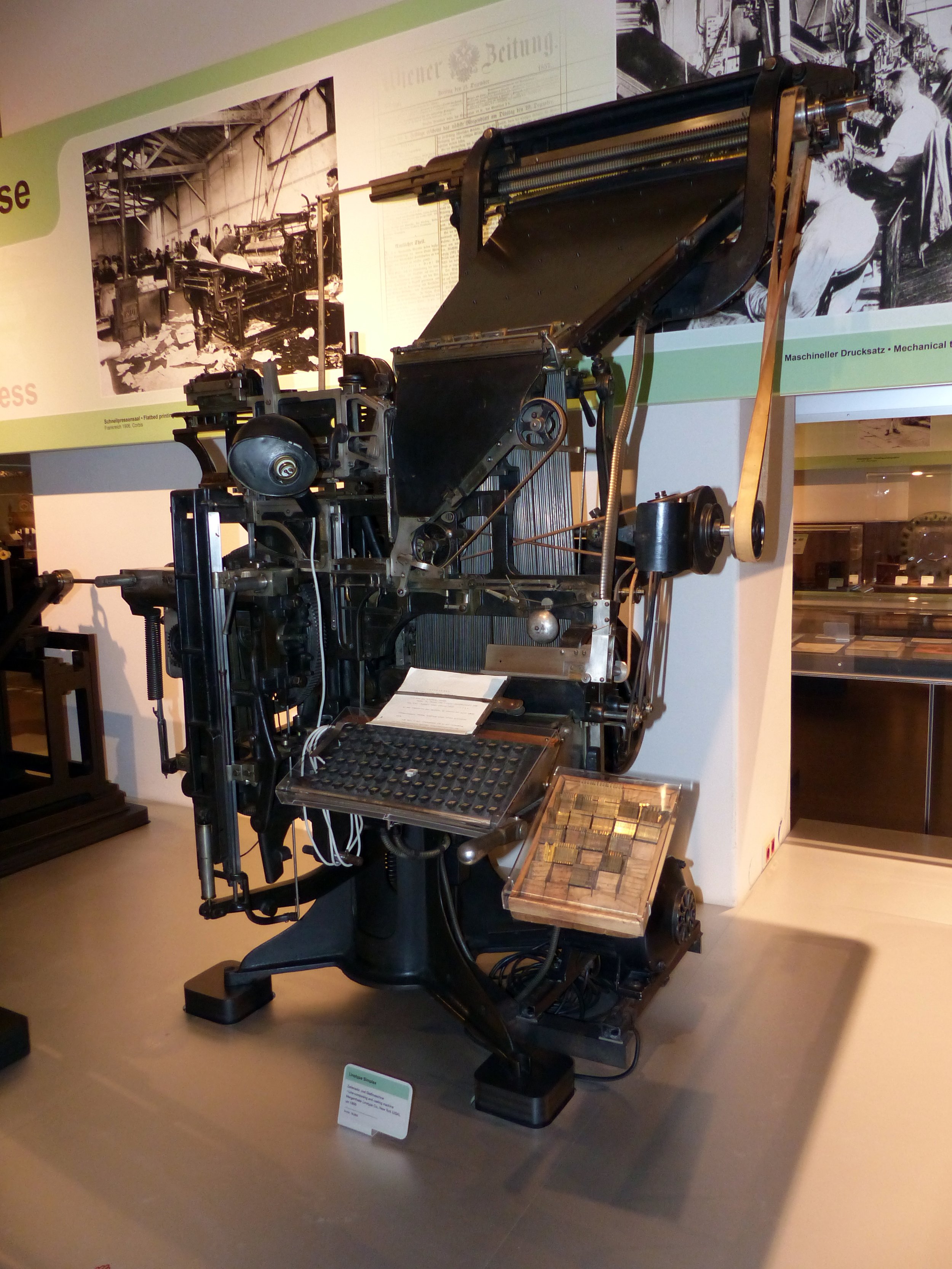
Linotype Simplex, line typesetting and casting machine, Mergenthaler Linotype Co., New York, around 1895; Exhibit in the Vienna Technical Museum, photo by Dr Bernd Gross
Henry Lewis Bullen, author of the Origin and Development of the Linotype Machine, died shortly before the outbreak of World War II. Originally employed in the sales department of the American Typefounders Corporation, in the 1920s he devoted all his energies to establishing the ATF Typographic Library, later acquired by Columbia University.
Bullen was also associated with the early development of the Linotype Machine and he was a writer of great authority on the subject. The first Linotype machines were installed in the UK in 1890 and immediately superseded typesetting machines such as the Hattersely, Thorne and Empire, which never really gained a footing in composing rooms since they were not economic to operate unless cheap labour (female or child) could be employed to work the distributing apparatus. With the Linotype the question of distribution did not arise, since the matrices were automatically returned to the magazine and the type melted down after use; thus composing room practice was revolutionized, since printers no longer needed to purchase type by the ton.
Hilary ‘Harry’ Pepler
Hilary ‘Harry’ Pepler’s book of essays The Hand Press was printed and published on behalf of the Chicago Club of Typothetae in 1931. Pepler was the founder of the St Dominic’s Press, Ditchling, Sussex, an office specializing in books and pamphlets of Roman Catholic interest. Eric Gill was associated with the Press in its early days. Although Pepler used machines for both composing and printing with skill and determination, he never lost his taste for hand printing in the traditional style.
The Hand Press is the book of an individualist, of a printer who had chosen to leave the beaten tracks of the trade, preferring the lonelier, but none-the-less worthy, path of old-fashioned craftsmanship and standards. The productions of the St Dominic’s Press have the same homespun quality as Pepler’s writing.
The printing profession is always the richer for such people for whom the largest machine, the longest-run, and the cheapest price are unimportant considerations, but who takes delight in producing small jobs well with neither impressive equipment nor fuss.
Alan Fletcher
November 2006 saw the opening at the Design Museum of the exhibition, ‘Alan Fletcher: fifty years of graphic work (and play)’. Fletcher, sadly died on 21 September 2006, was one of the most influential figures in British graphics as a founder of Fletcher/Forbes/Gill in the 1960s and Pentagram in the 1970s. His fusion of European tradition with North America’s pop culture in the formulation of his distinct approach made him a pioneer of independent graphic design in Britain during the late 1950s and 1960s. As a founding partner of Pentagram, Fletcher helped establish a model of combining commercial partnership with creative independence. He also developed some of the most memorable graphic schemes of the era, notably the brand identities for Pirelli, Reuters and the Victoria & Albert Museum, and transformed book design in his role as consultant art editor to Phaidon Press with his spirited, witty and very personal style. ‘Alan Fletcher: fifty years of graphic work (and play)’ presents his commercial work for Penguin, Reuters and Shell, alongside more personal projects in lettering, collage and illustration.
We’re grateful for authors of these articles and Dr Caroline Archer at Birmingham City University for the permission to use the articles in this blog.